


It is no surprise that Ethereum price performance over the past 15 months have been lackluster. Despite this bearish outlook, here are three Ethereum (ETH) charts that might instil hope among holders.
Ethereum Price Performance
Although Ethereum price ended 2024 with a gain of 62%, it is down 35% since 2024. The YTD performance shows a -52% return on investment with price chart showing lower lows and lower highs.
CryptoBirb, a popular analyst and crypto influencer said, “ETH chart is really sad to look at.”
One user said, if you invested $10,000 in Ethereum (ETH) in 2018, you would have the same amount in 2025, i.e., seven years later. This shows how bad the performance of the second-largest cryptocurrency has been. Regardless, let’s explore 3 charts that breathe hope for this token.
3 Charts That Give ETH Holders Hope
Despite this never-ending downtrend for Ethereum (ETH) price, there is stil hope as shown by these three charts.
- Ethereum’s declining net taker volume chart.
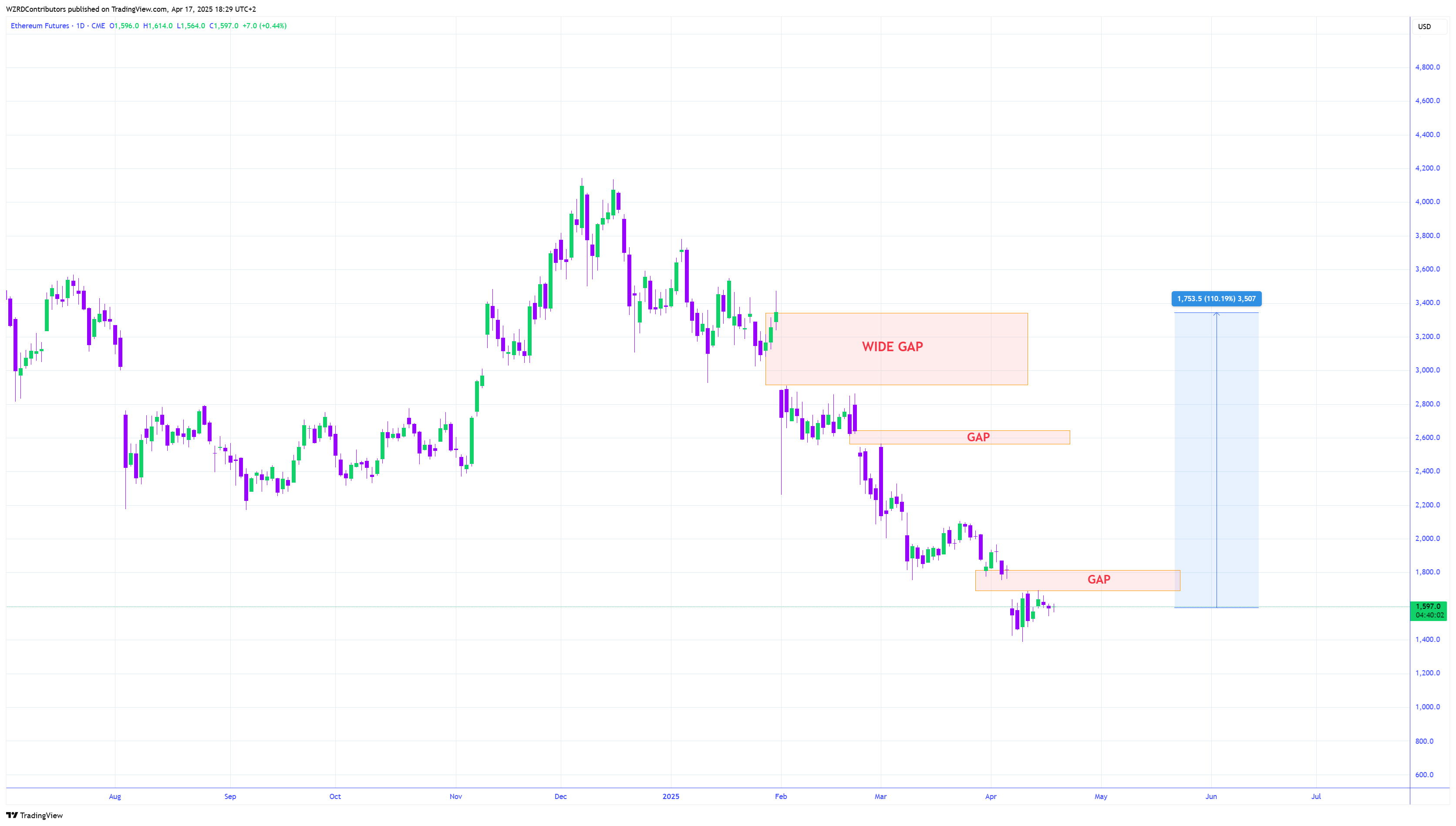
- The CME price chart shows four gaps, extending from $1,763 to $3,930, which could be filled.
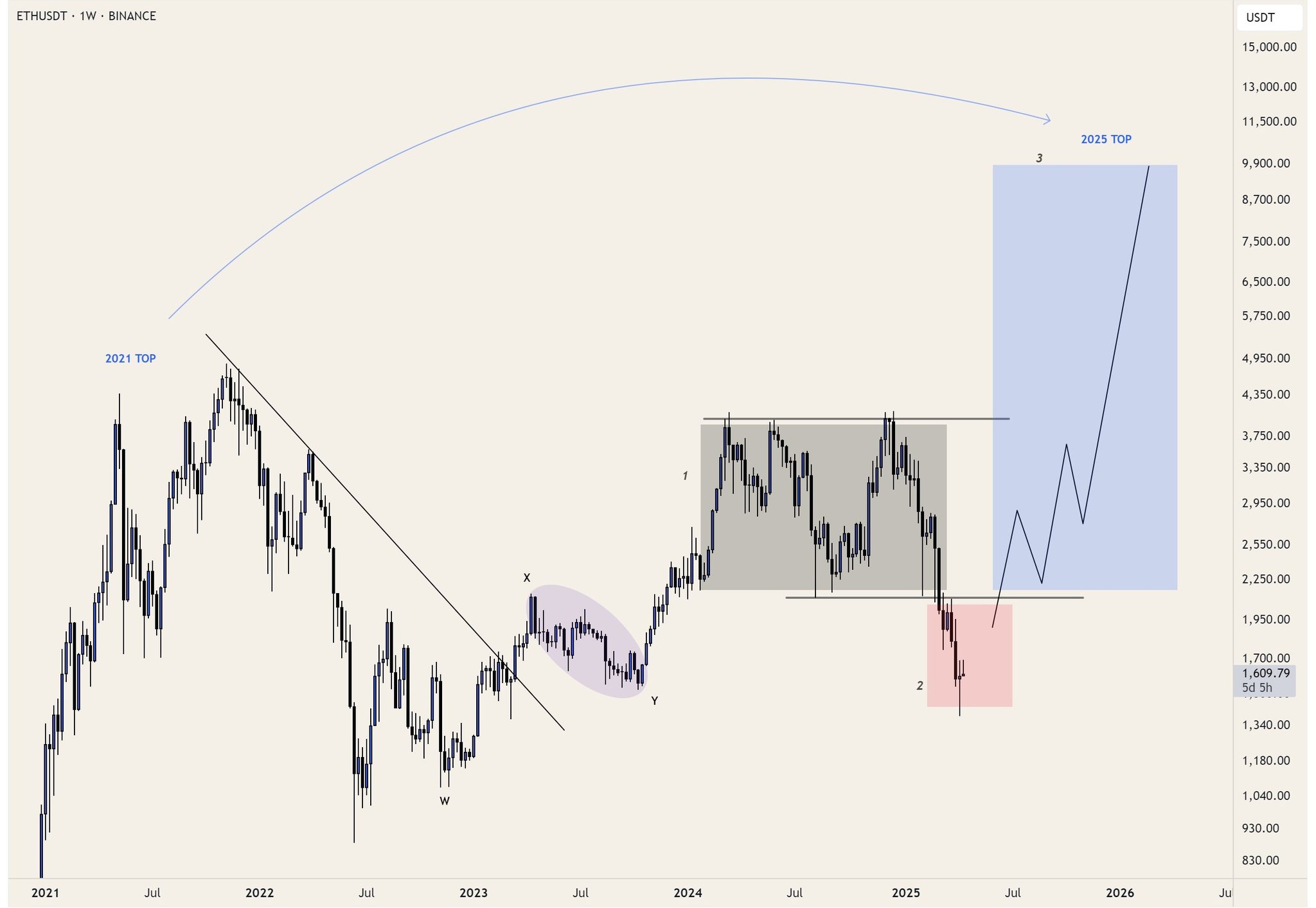
- The most bullish chart is a Power of three (PO3) setup that hints at a $9K to $10K target.
CryptoQuant data shows the net taker volume has been declining, suggesting an exhaustion of selling pressure. This shows that market sellers, institutional or retail, are done with their selling spree.
A similar exhaustion of net taker volume in September 2024 led to an extended rally that pushed the Ethereum price to $4,000.

The CME’s Ethereum price chart shows four gaps that could be filled if/when ETH forms a bottom. The first two gaps are small and start at $1,763 and $2,623. The third gap extends from $2,888 to $3,327, which is the key target and resistance zone during a recovery rally.
The fourth gap, albeit small, is present at $3,930, which is roughly 150% away from the current ETH’s value of $1,563.
The third chart shows Ethereum price on a weekly basis with a key pattern called as Power of Three (PO3). This setup contains a consolidation phase, where price ranges. This is followed by a manipulation phase where the price deviates below the previously formed range. The last phase is called a distributive phase, where the price explodes violently to new highs. Typically, the target is 161.8% Fibonacci extension of the consolidative phase. However, in this case, the analyst Belle provides a target of $9,900, very close to the $10,000 psychological level.
Despite a multi-year bearish performance, there are investors who believe that Ethereum price comeback will be explosive. For example, RektProof, a popular crypto trader, announced on April 6 that he will be buying $1,000 worth of Ethereum (ETH) every single day.
Buying 1000$ worth of #ETH daily for next several months as price forms a range
Posting daily updates on my telegram for anyone who wants to follow along
Focused on long term success https://t.co/NueZh9FuZP#Ethereum pic.twitter.com/KsEdMXyTjv
— RektProof. (@RektProof) April 6, 2025
So far, the analyst has acquired 8.267 ETH worth $13,263 and his investment is up 2.3%.
Will Ethereum price rise up and end its lackluster performance? It is still unsure, especially with Trump’s tariff wars set to restart on July 9, the crypto market is uncertain. Hence, any Ethereum price prediction will have low conviction due to the geopolitical and macroeconomic uncertainty.
The post 3 ETH Charts That Give Hope Despite Horrendous Ethereum Price Performance appeared first on CoinGape.